


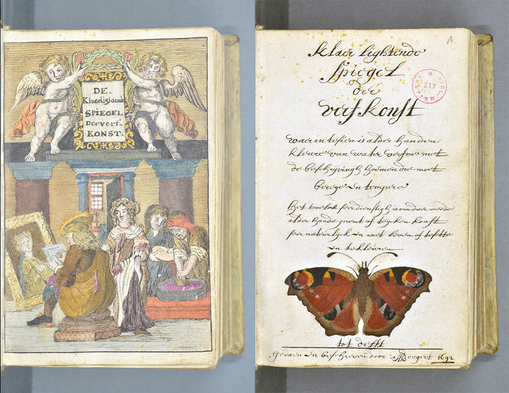
A designer told me about this vintage book, and I found it so interesting! In today’s color world, Pantone® is considered the worldwide expert and their Pantone® Color Guides are used by designers, manufacturers, and retailers in developing products and communicating accurate color information. Their first color guide (or Pantone Matching System) was published in 1963. But 271 years before that, a little-known Dutch artist, “A. Boogert,” wrote a book about color mixing that uncannily resembles today’s Pantone color chips! Here are some pictures from that vintage book, Traité des couleurs servant à la peinture à l’eau, as featured on the design site Colossal…
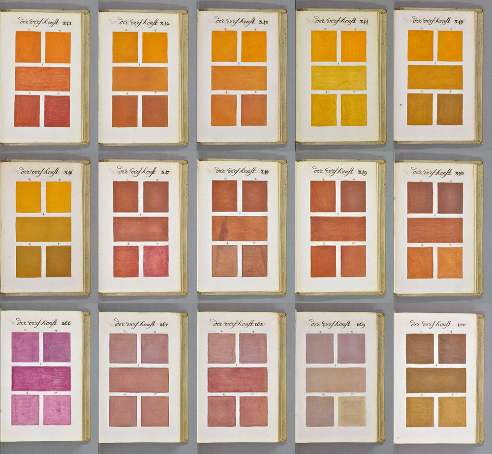
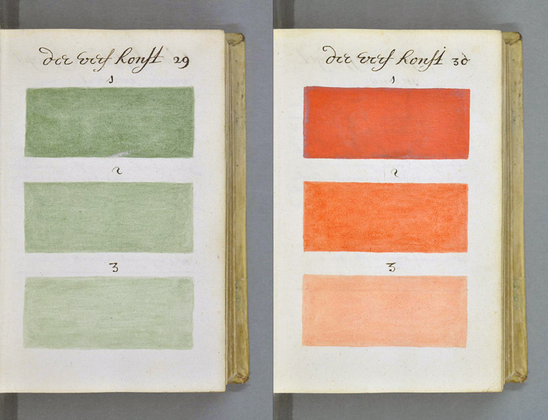
The book has almost 800 handwritten and hand painted pages; no other copies of it were ever produced. It is kept at the Bibliothèque Méjanes in Aix-en-Provence, France.
So there’s a little history lesson for you today! 🙂 I just love vintage books and find something like this beautiful and fascinating! Are you a collector of vintage books or other vintage items?

7 responses to “The Forerunner of Pantone: A Color Guide from 1692”
How interesting. Thanks for sharing :).
LikeLike
You’re welcome! I love looking at all those shades of color!
LikeLike
What a great find! Thanks for stopping by to comment on my bike story!
LikeLike
Thanks, Nancy! I didn’t know this.
LikeLike
I thought it was so interesting–Rick had given me a link about it–amazing how much those watercolor swatches look like pantone chips! 🙂
LikeLike
This is so cool! I love old books and the history of it all.
LikeLike
I do too! 🙂
LikeLike